웹 디자인 기능사 D 유형 CSS
웹디자인 기능사 D 유형
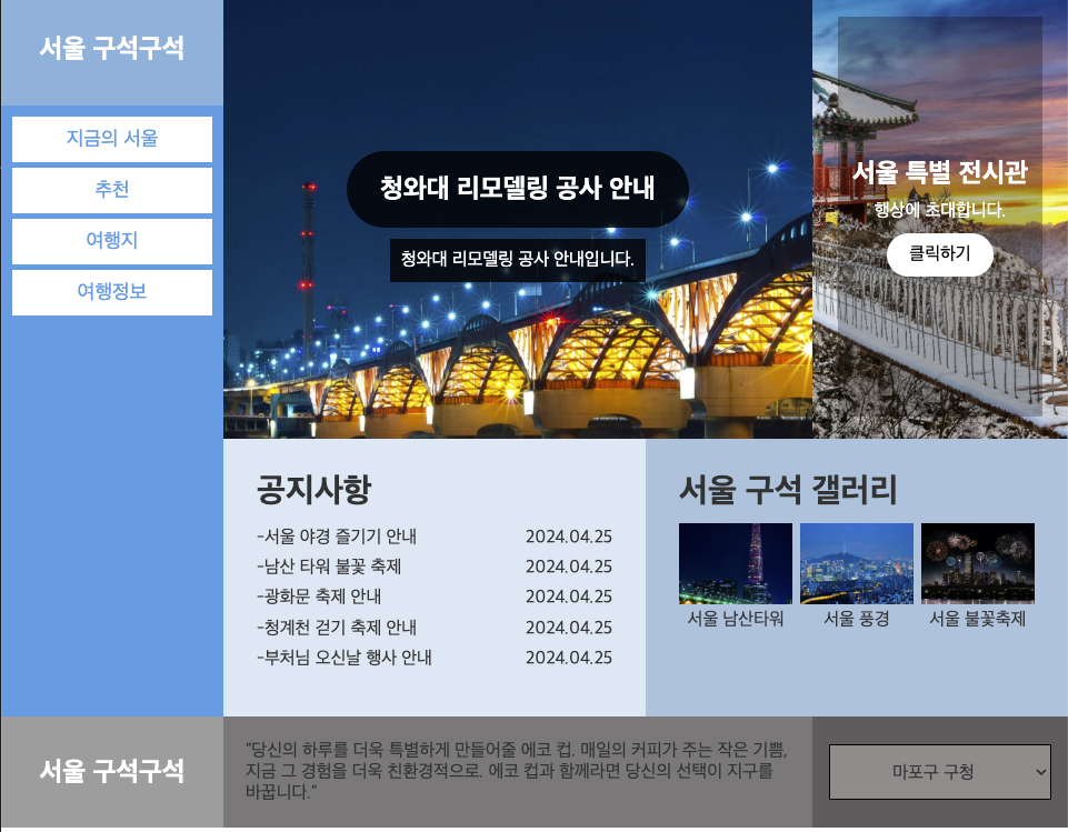
안녕하세요! 오늘은 웹디자인 기능사 D유형에 대해 공부 하도록 하겠습니다.
오늘 목표는 해당 이미지 처럼 완성 시키는게 목표 이므로 천천히 잘 쫓아오시길 바랍니다.
CSS 부분을 코딩 해보돌 하겠습니다.
common css
1
2
3
4
5
6
7
8
9
10
11
12
13
14
15
16
17
18
19
20
21
22
23
@charset "UTF-8";

* {
    padding: 0;
    margin: 0;
    box-sizing: border-box;
    color: #333;
}

a {
    text-decoration: none;
    color: #333;
}

li {
    list-style: none;
}

#wrap {
    display: flex;
    flex-wrap: wrap;
}
메뉴가 들어갔으니 공통적으로 들어가는건 기억해두시는게 좋습니다.
Header css
1
2
3
4
5
6
7
8
9
10
11
12
13
14
15
16
17
18
19
20
21
22
23
24
25
26
27
28
29
30
31
32
33
34
35
36
37
38
39
40
41
42
43
44
45
46
47
48
49
50
51
52
53
54
55
56
57
58
59
#header {
    width: 200px;
    background-color: #439ce4;
}

#header .logo {
    height: 100px;
    line-height: 100px;
    text-align: center;
    background-color: #7fb1db;
}

#header .logo a {
    color: #fff;
    font-size: 24px;
}

#header .nav {
    height: 550px;
    padding: 10px;
}

#header .nav>ul>li>a {
    width: 100%;
    padding: 10px;
    color: #439ce4;
    background-color: #fff;
    display: inline-block;
    text-align: center;
    font-size: 18px;
    margin-bottom: 5px;
}

#header .nav>ul>li>a:hover {
    background-color: #b5c9e4;
}

#header .nav>ul>li>ul {
    margin-bottom: 10px;
    display: none;
}

#header .nav>ul>li>ul>li {
    margin-bottom: 2px;
}

#header .nav>ul>li>ul>li>a {
    width: 100%;
    padding: 10px;
    color: #fff;
    background-color: #6eb1e7;
    display: inline-block;
    text-align: center;
    font-size: 18px;
}

#header .nav>ul>li>ul>li>a:hover {
    background-color: #2e90e0;
}
css 코딩을 하다보면 a에 패딩이 안먹히는 경우가 있습니다.
그럴 땐 당황하지말고 inline-block으로 설정 해두시면, 패딩값이 먹히는것을 확인 하실 수있습니다.
Main Css
1
2
3
4
5
6
7
8
9
10
11
12
13
14
15
16
17
18
19
20
21
22
23
24
25
26
27
28
29
30
31
32
33
34
35
36
37
38
39
40
41
42
43
44
45
46
47
48
49
50
51
52
53
54
55
56
57
58
59
60
61
62
63
64
65
66
67
68
69
70
71
72
73
74
75
76
77
78
79
80
81
82
83
84
85
86
87
88
89
90
91
92
93
94
95
96
97
98
99
100
101
102
103
104
105
106
107
108
109
110
111
112
113
114
115
116
117
118
119
120
121
122
123
124
125
126
127
128
129
130
131
132
133
134
135
136
137
138
139
140
141
142
143
144
145
146
147
148
149
150
151
152
153
154
155
156
157
158
159
160
161
162
163
164
165
166
167
168
169
170
171
172
173
174
175
176
177
178
179
180
181
182
183
184
185
186
187
188
 #main {
    width: calc(100% - 200px);
    height: 650px;
    background-color: #bbb;
}

#main .cont1 {
    width: 100%;
    display: flex;
}

#main .cont1 .sliders {
    width: calc(100% - 230px);
    height: 400px;
    overflow: hidden;
}

.slider-wrap {
    position: relative;
    width: 100%;
    height: 400%;
    display: flex;
    flex-direction: column;
}

.slider-wrap .slider {
    width: 100%;
    height: 100%;
    background-size: cover;
    background-position: center;
    background-repeat: no-repeat;
    display: flex;
    align-items: center;
    justify-content: center;
    flex-direction: column;
}

.slider-wrap .slider h2 {
    color: #fff;
    background-color: #000000c6;
    border-radius: 50px;
    padding: 20px 30px;
    margin-bottom: 10px;
}

.slider-wrap .slider p {
    background-color: #000000c6;
    color: #fff;
    padding: 10px;
}

.slider-wrap .slider.s1 {
    background-image: url(../images/slider01.jpg);
}

.slider-wrap .slider.s2 {
    background-image: url(../images/slider02.jpg);
}

.slider-wrap .slider.s3 {
    background-image: url(../images/slider03.jpg);
}


#main .cont1 .banner {
    width: 230px;
    height: 400px;
    background: url(../images/banner01.jpg) center / cover;
    display: flex;
    align-items: center;
    justify-content: center;
}

#main .cont1 .banner>div {
    text-align: center;
    width: 80%;
    height: 90%;
    background-color: #00000047;
    display: flex;
    align-items: center;
    justify-content: center;
    flex-direction: column;
}

#main .cont1 .banner>div h3 {
    color: #fff;
    font-size: 24px;
}

#main .cont1 .banner>div p {
    padding: 10px;
    color: #fff;
}

#main .cont1 .banner>div a {
    color: #000;
    background-color: #fff;
    padding: 10px 20px;
    border-radius: 50px;
}

#main .cont2 {
    display: flex;
}

#main .cont2 .notice {
    width: 50%;
    height: 250px;
    padding: 30px;
    background-color: #d9e8f5;
}

#main .cont2 .notice h3 {
    font-size: 30px;
    margin-bottom: 10px;
    overflow: hidden;
    text-overflow: ellipsis;
    white-space: nowrap;
}

#main .cont2 .notice li {
    display: flex;
    justify-content: space-between;
    line-height: 1.7;
}

#main .cont2 .notice li::before {
    content: '-';
}

#main .cont2 .notice li a {
    width: 70%;
    overflow: hidden;
    text-overflow: ellipsis;
    white-space: nowrap;
}

#main .cont2 .notice li span {
    width: 30%;
    text-align: right;
}

#main .cont2 .notice li a:hover {
    text-decoration: underline;
    text-decoration-skip: under;
}

#main .cont2 .gallery {
    width: 50%;
    height: 250px;
    padding: 30px;
    background-color: #a5c3db;
}

#main .cont2 .gallery h3 {
    font-size: 30px;
    margin-bottom: 10px;
    overflow: hidden;
    text-overflow: ellipsis;
    white-space: nowrap;
}

#main .cont2 .gallery ul {
    display: flex;
    justify-content: space-between;
}

#main .cont2 .gallery li {
    width: 32%;
    text-align: center;
}

#main .cont2 .gallery li a img {
    width: 100%;
    max-width: 180px;
    display: block;
    margin: 0 auto;
}

#main .cont2 .gallery li a span {
    margin-top: 5px;
    display: block;
}

#main .cont2 .gallery li a:hover {
    opacity: 0.5;
}
main쪽 css가 많은 것을 볼 수 있는데 cont로 섹션을 나누고 슬라이드에 이미지까지 넣어야 하기 때문에 길 수 밖에 없습니다.
Footer Css
1
2
3
4
5
6
7
8
9
10
11
12
13
14
15
16
17
18
19
20
21
22
23
24
25
26
27
28
29
30
31
32
33
34
35
36
37
38
39
40
41
42
43
44
45
46
47
48
49
 #footer {
    width: 100%;
    display: flex;
}

#footer .title {
    width: 200px;
    height: 100px;
    background-color: #9e9d9d;
    display: flex;
    justify-content: center;
    align-items: center;
}

#footer .title h4 {
    font-size: 24px;
    color: #fff;
}

#footer .copy {
    width: calc(100% - 430px);
    height: 100px;
    background-color: #7b7878;
    display: flex;
    align-items: center;
    justify-content: center;
}

#footer .copy p {
    padding: 20px;
}

#footer .family {
    width: 230px;
    height: 100px;
    background-color: #5f5c5c;
    display: flex;
    justify-content: center;
    align-items: center;
}

#footer .family select {
    width: 200px;
    height: 50px;
    border: 1px solid #000;
    background-color: #938c8c;
    text-align: center;
    font-size: 16px;
}
footer 쪽은 별반 다를게 없습니다.
이번엔 창을 클릭하게 되면 modal이 나오는것을 만들어 보겠습니다.
1
2
3
4
5
6
7
8
<div class="modal">
            <h4>경마장 티켓 예매 일정</h4>
            <p>안녕하세요, 경마장 운영팀입니다. 경마장 티켓 예매 일정에 변경이 있어 안내드립니다.
                기존 예매 일정에 따르면 6월 1일부터 6월 30일까지 티켓 예매가 가능하였으나, 운영상의 문제로 인해 일정이 변경되었습니다.
                불편을 끼쳐 드려 죄송합니다.
            </p>
            <a href="#" class="popup-close">닫기</a>
        </div>
먼저 html로 모달을 설정 합니다.
그 이후 css를 코딩 합니다.
1
2
3
4
5
6
7
8
9
10
11
12
13
14
15
16
17
18
19
20
21
22
23
24
25
26
27
28
29
.modal {
    display: none;
    position: absolute;
    left: 50%;
    top: 50%;
    transform: translate(-50%, -50%);
    width: 300px;
    height: 300px;
    background-color: #9dccf2;
    border: 4px solid rgb(0, 100, 167);
    padding: 20px;
    z-index: 2000;
}

.modal h4 {
    font-size: 24px;
    margin-bottom: 15px;
}

.modal a {
    display: inline-block;
    padding: 2px 20px;
    background-color: #0682e7;
    color: #fff;
    position: absolute;
    left: 50%;
    bottom: 20px;
    transform: translateX(-50%);
}
이렇게 하게 되면
해당 modal이 나오는것을 확인 하실 수 있습니다.
이제 하이라이트인 javascript jquery를 알려드리겠습니다.
jquery menu
1
2
3
4
5
6
7
8
$(function(){
    $(".nav>ul>li").mouseover(function(){
        $(this).find(">ul").stop().slideDown();
    });
    $(".nav>ul>li").mouseout(function(){
        $(this).find(">ul").stop().slideUp();
    });
})
이러면 메뉴탭 기능은 구현 된것이 확인 될겁니다.
jquery modal
1
2
3
4
5
6
7
8
 // 모달
    $(".notice ul li:nth-child(1)").click(function () {
        $(".modal").show();
    });
    $(".modal a").click(function () {
        $(".modal").hide();
    })
해당 코드를 보게 되면 첫번째 공지사항 li를 클릭하게 되면 modal 창이 나오는것을 확인 하실 수 있습니다.
hide()는 숨기는 것이고, show()는 보여주는 것입니다.
jquery slider
1
2
3
4
5
6
7
8
9
10
11
12
13
14
15
16
   //슬라이드
            let currentIndex = 0;
            $(".slider-wrap").append($(".slider").first().clone(true));

            setInterval(() => {
                currentIndex++;

                $(".slider-wrap").animate({ marginTop: -400 * currentIndex + "px" }, 600);

                if (currentIndex == 3) {
                    setTimeout(() => {
                        $(".slider-wrap").animate({ marginTop: 0 }, 0);
                        currentIndex = 0;
                    }, 600);
                }
            }, 3000);
여기서 가장 중요한 것은 3번쨰 사진이 끝났을 때 첫번째 사진이 다시 나와야 하는 것입니다.
append로 어디를 복사 할지 찾고 first() 첫번째를 clone하는것을 허락 해야합니다.
다음으로 slider-wrap에 animate를 걸어주고 marginTop 이든 marginLeft든 상황에 맞춰 코딩 해주시면 됩니다.